Cartography, the art and science of mapmaking, has long been a window into human understanding of the world. From ancient sketches on clay tablets to the sophisticated digital globes of today, maps have charted explorations, delineated empires, and guided generations. Yet, even with our ever-expanding knowledge, certain cartographic enigmas have persisted, whispering tales of lost lands, hidden routes, and forgotten civilizations. These are the world’s greatest map mysteries, tales that have captivated historians, archaeologists, and armchair adventurers alike, and in recent times, many of these puzzles have begun to yield their secrets, thanks to advancements in technology and a renewed dedication to historical inquiry.
For centuries, the elusive island of Hy-Brasil, also known as Hy Breasil, Brazil, or sometimes Brasil, was a recurring feature on maps of the North Atlantic. Portrayed as a vast, uncharted landmass west of Ireland, it appeared on charts from the 14th to the 18th centuries, fueling imaginations and sparking speculative voyages. Its consistent depiction suggests it was more than just a fanciful embellishment; it represented a genuine belief in a land that, for reasons unknown, remained perpetually hidden or inaccessible.
Early Cartographic Appearances and Descriptions
The earliest known depiction of Hy-Brasil can be traced to the 1339 Catalan Atlas, a monumental work that showcased a detailed understanding of the known world at the time. Here, an island labeled “Ylla de Brasil” is positioned in the mid-Atlantic. Subsequent maps, including those by Genoese cartographer Giovanni da Carignano and the influential Venetian cartographer Fra Mauro, continued to include this enigmatic land. These early representations often described it as a large island, sometimes inhabited, and occasionally featuring a significant river running through it. The name itself is believed to derive from the Celtic word “Hy,” meaning island, and “Brasil,” potentially referring to a mythical land of plenty or a place of warriors.
The Mythological and Folkloric Roots
The legend of Hy-Brasil is deeply intertwined with Irish mythology and folklore. Many scholars believe it is connected to the tales of Tír na nÓg, the “Land of Eternal Youth,” a mythical island paradise in the west, accessible only to a select few. Other theories link it to stories of enchanted islands that appeared and disappeared at will, or to the concept of the “seven cities” of Portuguese legend, which also pointed towards a westward landmass. Some scholars even suggest that the island might have been a conflation of various sightings of distant lands, fog banks, or unusual atmospheric phenomena that were misinterpreted as a solid landmass. The consistent belief in its existence, even without concrete proof, highlights the powerful human desire for the unknown and the allure of undiscovered territories.
Unraveling the Mystery: Scientific and Historical Explanations
The gradual disappearance of Hy-Brasil from maps in the late 18th and 19th centuries coincided with improved navigational techniques and a more thorough exploration of the Atlantic. While no physical landmass matching its description has ever been found, several plausible explanations have emerged to account for its persistent presence on maps.
The Phantom Island Theory
One of the most widely accepted theories is that Hy-Brasil was a “phantom island.” These are islands that appear on charts due to misidentification, optical illusions, or unreliable reports from sailors. Possible candidates for the origin of the Hy-Brasil legend include:
- The Azores or Canary Islands: These volcanic archipelagos, visible from afar, could have been mistaken for a larger, more distant landmass, especially in conditions of poor visibility or during prolonged voyages. The appearance of volcanic activity, such as eruptions, could have contributed to the perception of a dynamic and perhaps temporary land.
- Fata Morgana Mirages: Atmospheric phenomena like the Fata Morgana can create distorted and elevated images of distant objects, including coastlines or islands, making them appear where they are not. These mirages are particularly common in certain maritime conditions.
- Seamounts and Shoals: Submerged volcanic mountains (seamounts) or shallow areas of the sea floor (shoals) can sometimes create the illusion of a landmass, especially when viewed from a distance or during specific tidal conditions. If such features were exceptionally large or numerous, they might have been interpreted as an island.
- Misinterpreted Voyages and Folklore: Early cartographers relied heavily on sailors’ accounts, which were often embellished or based on incomplete information. Legends and folklore about western lands could have also influenced mapmakers, leading them to include Hy-Brasil as a known, albeit remote, entity.
The Role of Cartographic Tradition
Another significant factor in the persistence of Hy-Brasil was the power of cartographic tradition. Once an island appeared on a reputable map, it tended to be copied by subsequent cartographers, even if its existence was questionable. This created a self-perpetuating cycle, where the map itself became the evidence for the island’s existence, rather than any direct observation. The desire to produce comprehensive maps, filling every blank space, also played a role.
The Final Demise of the Legend
The Age of Exploration, with its increased focus on accurate charting and the systematic exploration of the Atlantic, gradually exposed the lack of a substantial landmass where Hy-Brasil was depicted. As explorers charted the ocean with greater precision, the space where Hy-Brasil was supposed to be was consistently found to be empty ocean. By the late 18th century, with the advent of more sophisticated navigational tools and a growing understanding of oceanography, the phantom island of Hy-Brasil began to fade from maps, becoming a curious footnote in the history of cartography. While it may have been a fabrication, its story serves as a fascinating testament to the power of belief, myth, and the enduring human quest for the unknown.
If you’re intrigued by the enigmatic aspects of world maps and the mysteries they hold, you might find the article on “Unraveling the Secrets of Ancient Cartography” particularly enlightening. This piece delves into the historical significance of ancient maps and how they have shaped our understanding of geography over the centuries. To explore this fascinating topic further, visit the article at My Geo Quest.
The Vinland Map: A Medieval Masterpiece or a Modern Hoax?
The Vinland Map, a medieval parchment depicting a portion of North America, purportedly drawn decades before Christopher Columbus’s voyages, has been one of cartography’s most tantalizing and controversial enigmas. Its potential to rewrite the history of European discovery in the Americas has fueled intense debate, scientific analysis, and accusations of forgery.
The Discovery and Initial Excitement
The map first surfaced in 1957, purchased by antiquarian booksellers from a Swiss book dealer. It was later acquired by Yale University, where it was hailed as a potential revolutionary document. The map shows Greenland and a large island to its west, identified as “Vinlanda Insula,” a name strongly associated with the Norse exploration of North America in the late 10th and early 11th centuries, as documented in the Icelandic Sagas. If authentic, it would have provided concrete cartographic evidence of Viking voyages to the continent centuries before Italian explorers.
The Cartographic Context: Norse Exploration of North America
The sagas of Erik the Red and others tell of Norse explorers, led by Leif Erikson, reaching North America around 1000 AD. They established settlements in areas they called Helluland (likely Baffin Island), Markland (likely Labrador), and Vinland (likely Newfoundland and surrounding areas). However, tangible evidence of these voyages had been limited until the discovery of the L’Anse aux Meadows settlement in Newfoundland, a UNESCO World Heritage site, which confirmed the Norse presence. The Vinland Map, if genuine, would have provided a pre-Columbian map of these newfound lands.
The Scientific Scrutiny: Ink and Parchment
The authenticity of the Vinland Map has been subjected to rigorous scientific examination, revealing conflicting evidence that has kept the debate alive for decades.
Pigment Analysis: The Titanium Enigma
One of the most significant challenges to the map’s authenticity arose from the analysis of its ink. In the early 1970s, scientists discovered the presence of anatase titanium dioxide in the ink. This compound was not widely manufactured or used in ink until the 20th century. This discovery led many to believe the map was a modern forgery, created using contemporary materials.
Radiocarbon Dating and Parchment Analysis
Further analysis, including radiocarbon dating of the parchment itself, indicated that the animal skin used for the map originated from the early 15th century. This date is problematic: it predates Columbus but is also centuries after the purported Viking voyages. If the parchment is indeed from the 15th century, then the ink must have been applied around that time. This still doesn’t definitively prove it’s a Viking map, but it places its creation before Columbus.
Stylistic and Linguistic Clues
Proponents of the map’s authenticity point to stylistic elements and linguistic features that they argue are consistent with medieval cartography and Norse language. They suggest that the titanium could have been present in natural pigments used in the medieval period, albeit in much smaller quantities, or that it was introduced through contamination. Some have proposed that the map was drawn on reused parchment, with the titanium pigment added later.
The Persistent Controversy: A Case of Modern Forgery?
Despite the evidence against its medieval origins, some scholars continue to champion the Vinland Map’s authenticity. They argue that the scientific tests are not conclusive and that the historical context of Norse exploration remains compelling. However, the weight of scientific evidence, particularly the presence of anatase titanium dioxide in the ink, has led the majority of the academic community to consider the map a sophisticated 20th-century forgery.
The debate continues, with new analytical techniques constantly being applied. The Vinland Map remains a powerful symbol of the allure of rewriting history and the challenges inherent in verifying ancient artifacts. Whether a genuine relic of Norse exploration or a masterful modern deception, it has undoubtedly carved its own significant place in the annals of cartographic mysteries.
The Waldseemüller Map: The Birthplace of “America”
The 1507 Waldseemüller map, created by German cartographer Martin Waldseemüller, holds a pivotal place in cartographic history not because of a mystery it solved, but because it was the first to label the newly discovered lands of the Western Hemisphere as “America.” This seemingly simple act had profound and lasting consequences, forever imprinting the name of explorer Amerigo Vespucci onto the continents.
The Context of Discovery: Amerigo Vespucci’s Voyages
In the years following Columbus’s 1492 voyage, there was considerable debate about the nature of the lands he had encountered. Many believed they were the easternmost reaches of Asia. However, Florentine explorer Amerigo Vespucci, through his own voyages and writings, argued that these lands constituted a “New World” entirely separate from Asia. His widely circulated letters, particularly Mundus Novus (New World), published in 1503, were instrumental in shaping European understanding.
Waldseemüller’s Ambition: A Comprehensive World Map
Martin Waldseemüller, a scholar working in Saint-Dié-des-Vosges (in modern-day France), was part of a humanist circle dedicated to advancing geographical knowledge. He aimed to produce the most accurate and comprehensive world map possible, incorporating the latest discoveries. He collaborated with cartographer Matthias Ringmann and printer Johann Schott.
The Naming of America: A Conscious Decision
Waldseemüller’s 1507 world map, a large woodcut, was groundbreaking in several ways. It was the first to depict a separate Western Hemisphere and, crucially, the first to label the southern landmass as “America,” in honor of Amerigo Vespucci. This decision was explicitly explained in the accompanying book, Cosmographiae Introductio (Introduction to Cosmography), which stated that the continent was named after its discoverer, “Americus,” as it would be illogical to name it after Columbus, who believed he had reached Asia.
The Enigma of Waldseemüller’s Recantation
Despite his bold naming decision, Waldseemüller himself later seemed to have second thoughts. In his 1513 edition of Ptolemy’s Geographia, he presented a new world map that omitted the name “America” and instead labeled the southern continent “Terra Incognita” (Unknown Land) or “Terra Laboratoris” (Land of the Laborer). This apparent retraction has fueled speculation and added a layer of mystery to the story.
Possible Reasons for the Recantation
- Influence of Columbus’s Supporters: It’s possible that Waldseemüller was pressured by those who felt Columbus deserved the honor of naming the continent, or that he recognized the political and historical significance of Columbus’s initial voyages.
- Shifting Geographical Understanding: As more was learned about the vastness of the newly discovered lands, the initial interpretation of them as a single continent named “America” might have seemed premature or inaccurate.
- Desire for a More “Accurate” Label: By 1513, the extent and complexity of the Americas were becoming clearer. Waldseemüller might have felt that a more general label like “Terra Incognita” was more appropriate for a land still largely unknown and unmapped.
- Simple Error or Oversight: It’s also possible that the omission was an administrative oversight or a stylistic choice in the later map, rather than a deeply considered retraction.
The Enduring Legacy: The Name Sticks
Regardless of Waldseemüller’s personal reservations, the name “America” had already begun to gain traction. The 1507 map was widely distributed and influential. As subsequent explorers and cartographers adopted the name, it became indelibly linked to the continents. By the time Waldseemüller published his 1513 map, the “America” was already a nascent geographical term with momentum.
The Waldseemüller map is not a mystery in the sense of an unsolved puzzle, but rather a fascinating case study in how geographical names are assigned and how historical narratives can evolve. It highlights the pivotal role of individual cartographers in shaping our understanding of the world and the sometimes-enigmatic motivations behind their decisions. The very act of naming a continent is a profound historical and cultural event, and Waldseemüller’s choice, despite his later hesitations, has had an unparalleled impact on global geography.
The Piri Reis Map: A Pre-Columbian World of Unknowns
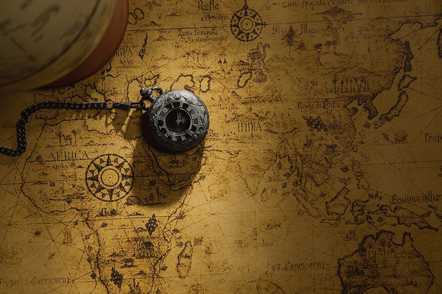
The Piri Reis map, a fragment of a larger world map compiled in 1513 by Ottoman admiral and cartographer Piri Reis, is renowned for its surprisingly accurate depiction of coastlines and its inclusion of lands purportedly unknown to Europeans at the time of its creation. The map’s most astonishing feature is its apparent depiction of Antarctica, free of ice, and potentially showing the continent’s coastline as it would have appeared thousands of years ago.
The Admiral’s Source Material: A Cartographic Collage
Piri Reis, a skilled mariner and scholar, claimed to have compiled his map using a vast array of sources, including approximately twenty different charts and maps. He explicitly mentioned that these included Arab, Indian, Portuguese, and even a map drawn by Christopher Columbus himself, which he claimed to have obtained from a captured Spanish sailor. This eclectic approach suggests an attempt to synthesize all available geographical knowledge.
The Astonishing Depiction of Antarctica
The most controversial and debated aspect of the Piri Reis map is its depiction of the southern polar region. The extant fragment shows a landmass that strongly resembles the coastline of Antarctica. However, this depiction is free of ice, suggesting it was drawn when the continent was ice-free, a state that has not existed for thousands of years.
The “Ice-Free Antarctica” Hypothesis
Proponents of the map’s advanced knowledge, most notably explorer and writer Charles Hapgood, have argued that the Piri Reis map provides evidence of an ancient, advanced civilization that possessed sophisticated cartographic knowledge, capable of mapping Antarctica before it was covered in ice. Hapgood’s theory, detailed in his book Maps of the Ancient Sea Kings, posits that this civilization mapped the world accurately and that Piri Reis somehow accessed these lost charts.
Scientific and Historical Counterarguments
The “ice-free Antarctica” hypothesis has faced significant criticism from mainstream scientists and historians.
- Misinterpretation of the Map: Many scholars argue that the southern landmass depicted is not Antarctica at all, but rather a misinterpretation of South America or a speculative representation of the mythical southern continent, Terra Australis. The accuracy of the depiction is questioned, with many lines and features being attributed to cartographic conventions or inaccuracies rather than precise mapping.
- Columbus’s Map: The claim that Piri Reis used a map drawn by Columbus is itself a point of contention. While Columbus did keep detailed logs and make some rudimentary sketches, there is no historical evidence of him creating a world map of the scope suggested by Piri Reis’s claims. If Piri Reis did see a map by Columbus, it likely would have been limited to the Caribbean and possibly parts of the Americas already explored by Europeans.
- Known Geographical Knowledge: Experts suggest that the features attributed to advanced knowledge could have been derived from known geographical information available in the early 16th century. For instance, knowledge of South America’s coast was rapidly expanding, and its southern tip could have been extrapolated or speculated upon to form a larger southern landmass.
- Cartographic Conventions of the Time: The lines and shapes on the map can also be explained by the cartographic conventions and limitations of the era. Piri Reis might have blended information from various sources, some of which were speculative or inaccurate, leading to a composite that appears remarkably prescient to modern eyes but is understandable within its historical context.
The Unraveling of the Mystery: A Complex Synthesis
While the Piri Reis map remains a source of fascination, the prevailing scientific and historical view is that it is a product of its time, albeit a remarkably sophisticated one. Piri Reis was a skilled cartographer who had access to a wealth of information, including charts from various cultures and potentially some early European explorations of the Americas.
The Synthesis of Existing Knowledge
It is more likely that Piri Reis synthesized information from his various sources, combining accurate depictions of known coastlines with speculative elements and the prevailing geographical theories of his time. His map represents an ambitious attempt to create a comprehensive world view based on the best available information. The perceived accuracy of the “Antarctic” coast might be a result of clever extrapolation, the use of maps from sources not fully understood by modern historians, or even coincidental resemblance.
The Enduring Allure of the Unknown
Despite the explanations, the Piri Reis map continues to fuel discussions about lost civilizations and ancient knowledge. It serves as a powerful reminder that our understanding of the past is often incomplete and that the allure of uncovering hidden histories remains strong. The map’s mystery lies not necessarily in its proof of an ancient advanced civilization, but in the complex tapestry of sources and knowledge that Piri Reis masterfully, and perhaps enigmatically, wove together.
Exploring the enigmatic aspects of world maps can lead to fascinating discoveries, and one article that delves into these mysteries is particularly insightful. It discusses various historical inaccuracies and the intriguing stories behind them, shedding light on how our understanding of geography has evolved over time. For a deeper dive into these captivating topics, you can read more in this related article that uncovers the secrets hidden within our world maps.
The Mercator Projection: A World Distorted, Yet Indispensable
| Location | Mystery | Explanation |
|---|---|---|
| Easter Island | Giant stone statues | Believed to represent ancestors and were moved using a system of ropes and sleds. |
| Nazca Lines, Peru | Giant geoglyphs | Created by removing the top layer of reddish-brown iron oxide-coated pebbles to reveal the lighter-colored earth underneath. |
| Stonehenge, England | Neolithic monument | Believed to have been constructed as a ceremonial and burial site aligned with the movements of the sun and moon. |
Gerardus Mercator’s 1569 world map, based on his revolutionary “Mercator projection,” is arguably one of the most influential maps ever created. While not a mystery of lost lands or ancient civilizations, the projection itself presents a compelling paradox: it is a fundamentally distorted representation of the Earth’s surface, yet it remains indispensable for navigation and a powerful symbol of global connectivity. The mystery lies in understanding why this distortion occurs and how, despite it, the map achieved such enduring utility.
The Problem of Spherical Representation
The Earth is a sphere (or more accurately, an oblate spheroid), while maps are flat surfaces. Translating the curved surface of a sphere onto a flat plane inevitably leads to distortion. Areas, shapes, distances, and directions cannot all be preserved simultaneously. Early attempts at mapmaking struggled with this fundamental challenge, leading to inaccurate representations of landmasses and oceans.
Mercator’s Innovation: Preserving Direction
Mercator’s genius lay in his deliberate choice to preserve direction. His projection is a cylindrical projection where meridians (lines of longitude) are parallel and equidistant, and parallels (lines of latitude) are also parallel and equidistant. This geometric construction means that a straight line drawn on a Mercator map represents a rhumb line, a path of constant compass bearing.
The Rhumb Line: A Navigator’s Best Friend
For sailors, maintaining a constant compass bearing was crucial for navigating long distances across open oceans. The rhumb line allowed them to steer a consistent course without constantly recalculating their direction. Mercator’s projection made this possible by accurately representing these rhumb lines as straight segments.
The Unavoidable Distortion: Areas and Distances Magnified
The trade-off for preserving direction was significant distortion of area and distance, particularly at higher latitudes. As the parallels are stretched apart to maintain their equidistant spacing, areas become progressively exaggerated the further they are from the equator.
Greenland: A Giant Deception
The most famous example of this distortion is Greenland. On a Mercator map, Greenland appears larger than Africa, when in reality, Africa is roughly fourteen times the size of Greenland. Similarly, the vast expanses of Russia and Canada appear disproportionately large, while equatorial regions are compressed.
The Perils of Misinterpretation
This distortion has led to a widespread misunderstanding of global geography. For centuries, many people have perceived the world through the lens of the Mercator projection, leading to a skewed sense of the relative sizes of nations and continents. This has had geopolitical implications, with some arguing that it has contributed to a Eurocentric view of the world, emphasizing the perceived size and importance of European nations.
The Enduring Utility and Modern Reinterpretations
Despite its inherent inaccuracies, the Mercator projection has remained a cornerstone of navigation for centuries. Its utility for plotting courses and maintaining direction has made it an indispensable tool for mariners.
The Rise of Alternative Projections
In response to the limitations of the Mercator projection, numerous alternative projections have been developed, each designed to preserve different properties of the Earth’s surface. The Gall-Peters projection, for example, preserves area, leading to a more accurate representation of the relative sizes of countries but distorting shapes. The Winkel Tripel projection, which attempts to balance distortions of area, direction, and distance, is now favored by the National Geographic Society.
The Mercator’s Legacy in the Digital Age
Even in the digital age, the Mercator projection continues to be used, particularly in web mapping applications like Google Maps and OpenStreetMap. These platforms often use the “Web Mercator” projection, a variant that is optimized for screen display and faster rendering. However, users are increasingly aware of its distortions and some applications offer alternative views.
The “mystery” of the Mercator projection is not about its origin or intent, but about the profound paradox it embodies: a fundamentally flawed representation of reality that, through its ingenious mathematical design, became an essential tool for understanding and navigating that reality. It serves as a powerful reminder that maps are not neutral depictions but are shaped by purpose, compromise, and the ongoing human endeavor to understand and represent our complex world.
The Tabula Peutingeriana: A Roman Road Map of a Vanishing World
The Tabula Peutingeriana, or Peutinger Table, is a medieval copy of a Roman road map dating back to the 4th century AD. Unlike conventional maps that focus on geographical features, this unique itinerary depicts the Roman Empire’s vast network of roads, cities, and distances. Its peculiar elongated format, stretched out like a scroll, and its focus on the infrastructure of a vanished empire make it a captivating historical document and a cartographic enigma in its own right.
The Roman Road Network: The Arteries of an Empire
The Roman Empire was built on its unparalleled road system. These meticulously engineered routes connected distant provinces, facilitated trade, troop movements, and communication, and were a testament to Roman ingenuity and organizational prowess. The Tabula Peutingeriana offers a glimpse into this formidable network, showing hundreds of cities, distances between them, and important routes.
The Peculiar Format: An Itinerary, Not a Geography
The most striking feature of the Tabula is its format. It is not a geographically accurate representation of the world. Instead, it is an itinerary, a graphical representation of distances along major routes. The map is stretched horizontally, making the length of the empire appear far greater than its width. This distortion emphasizes the journey and the connections between places rather than their precise geographical relationships.
Stretching the Empire for Clarity
This elongated format was likely intentional. By stretching the empire horizontally, cartographers could fit an extensive network of roads and a multitude of settlements onto a manageable scroll. The relative distances between locations along these routes are depicted with a degree of accuracy, allowing travelers to plan their journeys and estimate travel times. However, the overall shape of landmasses and the relative positions of continents are significantly distorted.
Cities and Distances: A Window into Roman Life
The Tabula Peutingeriana names over 600 cities and approximately 100,000 kilometers (62,000 miles) of roads. Key cities like Rome, Constantinople, and Antioch are clearly marked, along with numerous smaller towns and settlements. The distances are given in Roman miles. This detail provides invaluable insights into the extent of Roman influence, the administrative divisions of the empire, and the logistical challenges of managing such a vast territory.
The Mystery of the “Missing” South
A notable characteristic of the Tabula is its incomplete depiction of southern regions, particularly Africa. While the northern coast of Africa is shown, the map quickly fades into blank space south of the Sahara Desert. This reflects the limited Roman knowledge and interest in the largely unknown interior of the continent, which was not as directly integrated into the empire’s administrative and economic systems.
The Medieval Copy: A Link to a Lost Original
The existing Tabula Peutingeriana is not the original Roman map but a medieval parchment copy created around the 13th century by a monk in Colmar, Alsace. The original map, likely drawn on papyrus or parchment, has long been lost. This means that the Tabula represents a copy of a copy, potentially introducing further inaccuracies and interpretations over centuries.
Tracing the Evolution of the Map
The challenges of reconstructing the original Roman map from this medieval copy are significant. Scholars have to account for potential errors introduced during the copying process, as well as the cartographic conventions of the Roman period itself. However, the fact that the map was deemed important enough to be copied and preserved highlights its enduring value as a historical document.
The Enduring Significance: More Than Just a Map
The Tabula Peutingeriana remains a profound historical artifact, offering a unique perspective on the Roman world. Its enigmatic format and focus on infrastructure provide a tangible connection to the lives and journeys of people in antiquity. It is a testament to the Roman Empire’s organizational capacity and the importance of its road network in unifying and managing its vast territories. While it may not depict the world as we see it today, it offers an unparalleled glimpse into a world that shaped much of our own, a world connected by Roman roads, stretching out across continents. The mystery of the Tabula lies in its selective representation and its ability to reveal the priorities and understanding of a civilization long past, a cartographic echo of a bygone era.
What Happens When No Country Owns a Place?
FAQs
What are some of the mysteries on world maps that have been explained?
Some of the mysteries on world maps that have been explained include the Piri Reis map, which was once thought to depict Antarctica before it was discovered, and the Vinland Map, which was believed to show Norse exploration of North America.
How have modern technologies helped to explain world map mysteries?
Modern technologies such as satellite imagery, carbon dating, and advanced imaging techniques have helped to explain world map mysteries by providing more accurate information about the age and origins of ancient maps.
What is the significance of understanding world map mysteries?
Understanding world map mysteries is significant because it helps to shed light on historical exploration, trade routes, and cultural interactions. It also provides insights into the knowledge and technology of ancient civilizations.
What are some common misconceptions about world map mysteries?
Some common misconceptions about world map mysteries include the belief that ancient maps accurately depicted the entire world, and the idea that certain maps were evidence of advanced ancient civilizations.
How do historians and researchers go about solving world map mysteries?
Historians and researchers solve world map mysteries by conducting thorough research, analyzing historical documents, using scientific methods to date and analyze maps, and collaborating with experts in various fields such as cartography, archaeology, and geography.